前 言

全球性专业石材展览会,第二十三届中国厦门国际石材展于2023年6月05-08日在厦门国际会展中心隆重举行。双循环新格局下,上下游全产业链,建筑、设计圈,跨界平台机构齐聚厦门,共同关注、探讨并推动石材行业高质量发展的新业态。

厦门人居设计生活节,由厦门国际石材展、IHIDA人居空间设计师俱乐部联合主办。通过产学研全方位角度将石材与设计精准链接,以展览、论坛、产业游学三大板块联袂呈现。以探索理想人居空间、设计驱动产业发展、重塑城市生活美学为愿景,构建人居美好生活新时代致力于推动设计产业发展进程,为石材行业提供更具开拓性及先锋精神的发声窗口,为中国石材消费市场带来新气象。


从2020年开始,石材与人居空间始终是厦门人居设计生活节的主旋律,我们探索石材在人居空间的变化、应用、创新,打破石材的固有边界,以设计赋予石材全新的审美价值与功能体验。

2023年6月5日-6月8日,厦门人居设计生活节 · 人居空间设计展在厦门国际会展中心盛大绽放。2023年,人居空间设计展以“石·间”为策展主题,由设计行业领袖梁志天担任主策展人,联盟业内赖旭东、杜恒、刘姮、刘道华、张力、朱晓鸣、赵益平、何永明、沈烤华等多位设计精英人物共同策展,希望借以不同的表达方式,去挖掘石材的可能性,探索人居生活的多样性。

展位:H10

石头浑然天成,是自然的馈赠、历史的传承。

通过质朴的黑金沙石墙体,走进一个概念性的空间,乍看之下,石影无踪,却触目皆是。一片片的天然碎石片,从原石上剥离下来,疏密有致地铺设于环绕整个空间的镜面上,形成无限折射的效果。中央的圆弧造型镜面与透光碎石片的拼接,成为空间的焦点。灯光或明或暗的循环变化,演绎时间的洗礼与沉淀、智慧的累积和人生的觉悟,如同原石化成碎片,经过雕琢后的蜕变与升华。石片后缓缓渗出灯光,更突显原石的自然纹理和质感,重塑成为艺术品,迎来了第二次的绽放。

《石非石》就好比人生,突破自身的局限,在经历各种磨练后的蜕变,更添智慧和力量去开启新的篇章,幻变出更多元的姿态,让人生更加丰盛多彩。

展位:H4

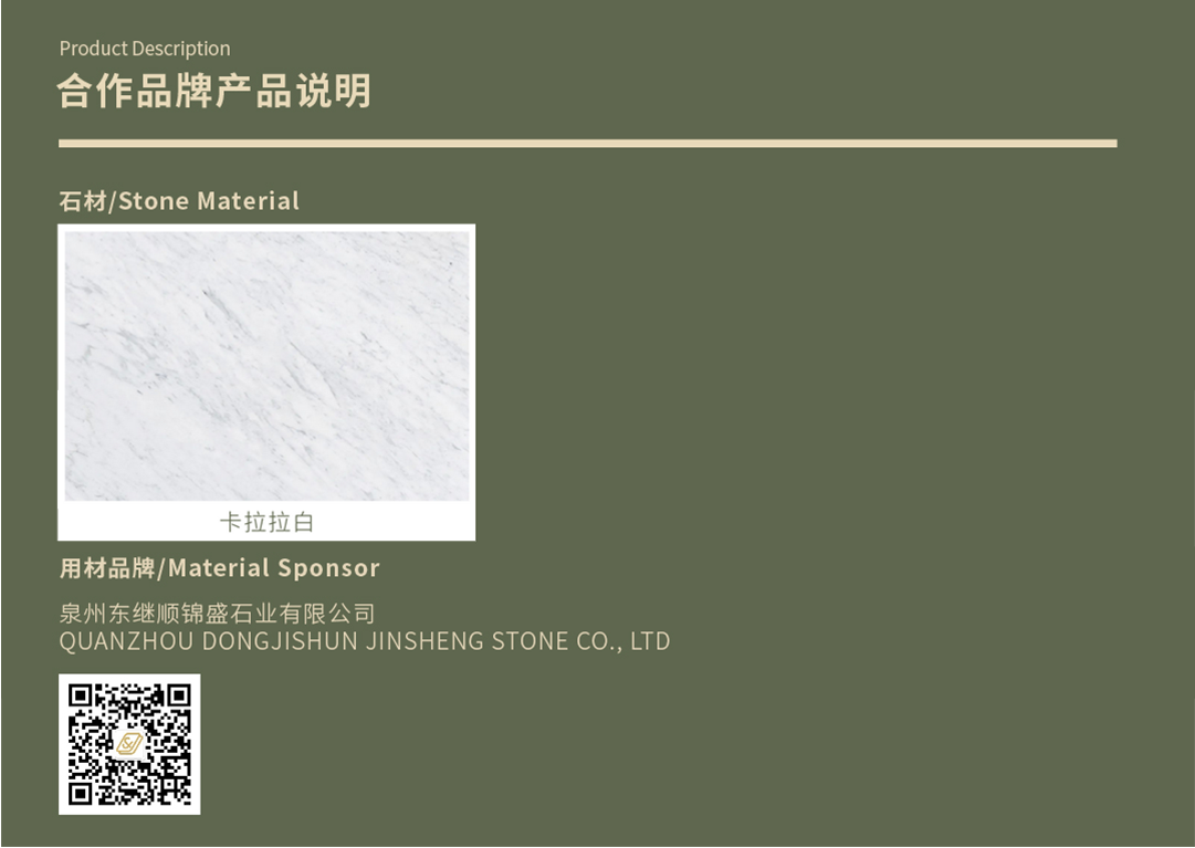
石材是源自于自然的一种传统建筑材料。

每条花纹每种色彩都记录了亿年的质变,浓缩在精美动人的石块之中。

是大自然馈赠的艺术品,是地球历史的一本抽象画册。
人居自然是建筑的灵魂,

人类的亲自然性注定了居室要处在自然的怀抱之中,或是自然要引入居室的心脏。

窗,正所谓“尺幅窗 · 无心画",正是此次展厅想要表达的主题。通过艺术展厅的形式,不论是窗还是石,都以画的形式展现,借窗观景,借画观石,借石给观展人带去来自于自然的赏心悦目的艺术品。

在展厅内部,通过点缀温馨的木质家居,软化石材的硬朗,精心地摆放模拟出家的场景,会心之处不在远,希望能给观展人“石材结合家居”的搭配的启发。

展位:H6

如今社会城市快节奏时代,钢架水泥建筑遍地拔起,空间营造神秘山谷 ,亲近自然的空间。

为了迎合主题,本次石材的色彩都是绿色为主,利用大面积墙地面石材与镜面不锈钢相结合。中间装置造型倒三角的形态,营造山谷形态的一种失重感。大面积的绿色在中间灯膜下和墙面镜面不锈钢交相反射,体现山谷神秘感、未来感。中间的景观装置利用苔藓和原石(展示石材还未打磨形成前的形态)形成自然生态空山环境 ,寓意回归自然心境。

展位:H5

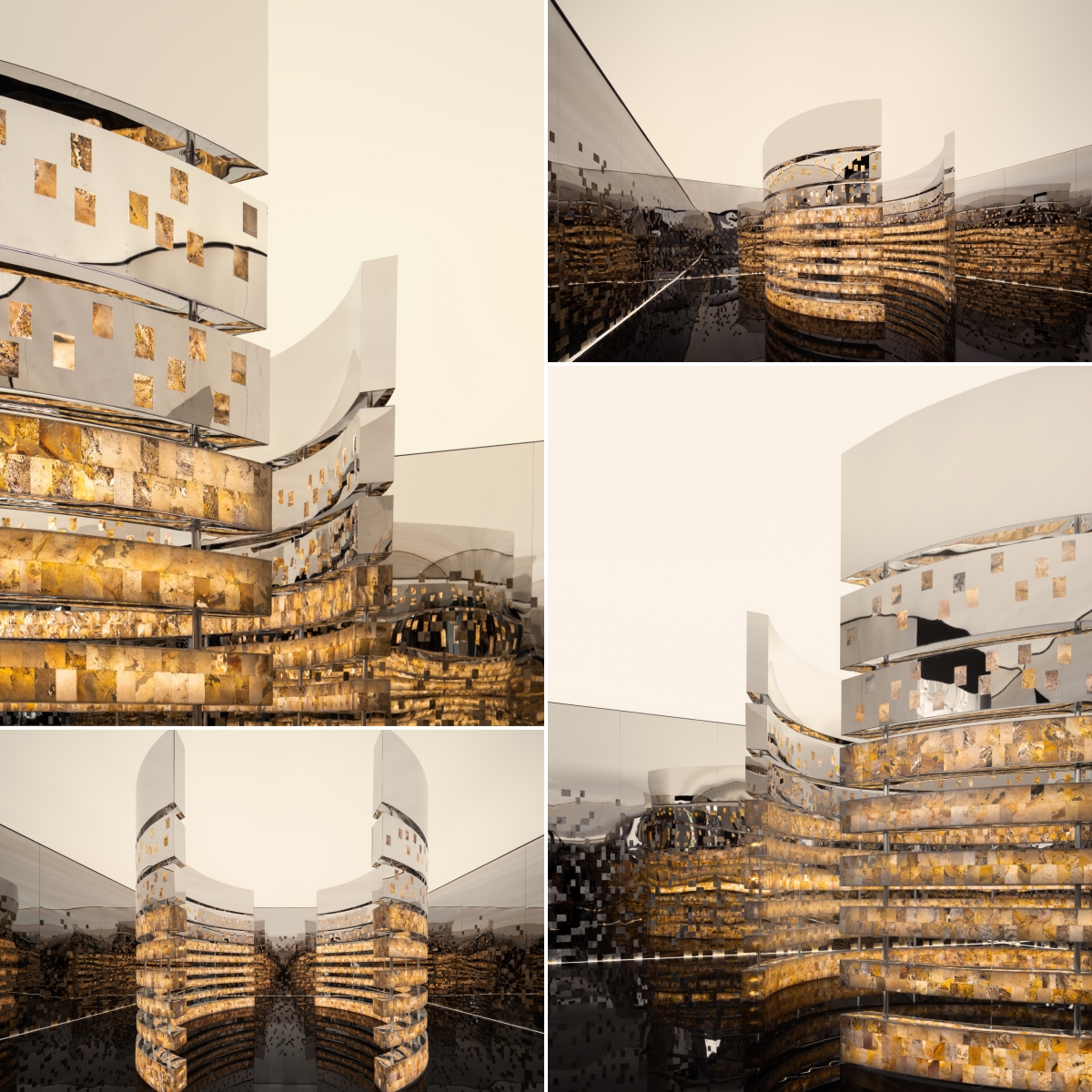
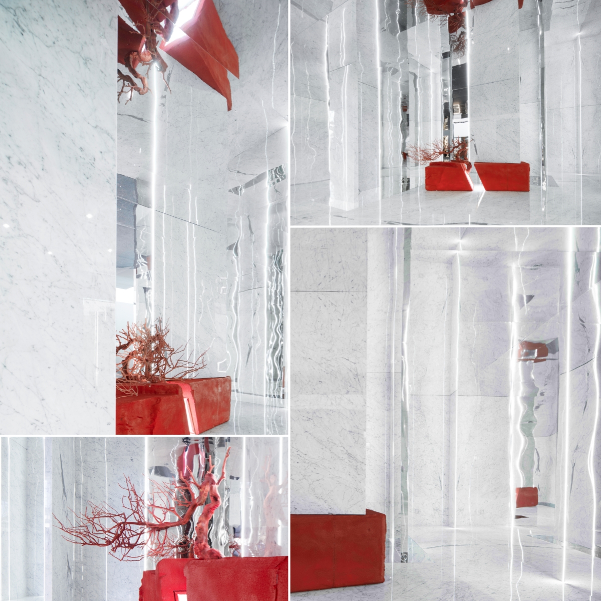
源即源头,源音同“圆”,源之所起,圆以为心,即循环往复也传承不息。

表达的是宇宙本然的运行模式,是整个大生命共同体的循环往复。在三万多年以前,人类还居住在石洞中,三万年后,我们将大自然最漂亮的石头放回空间中,这是一次奇妙的跨越人类漫长发展史的循环。生生不息的流动在时间长河中不断焕发新的光彩。

石与间、间与物、物与石之间相互联系,在不同空间与时间的想象与表达中,在自然的鬼斧神工与人类智慧叠加中被不断地塑造,因群体的共性与个体的独特性,石头与我们产生了瑰丽的化学反应。

展厅通过当代艺术手法重新构造,将石材家具串联成场域。展厅维持艺术空间一贯的冷峻与克制,将自然、艺术、人文情感完美融合,超然物外、镜象丛生。

展位:H1

石,自然的馈赠。

石的形态万千,从岩浆的液态到变质为坚硬的花岗岩,再在地表被风化为细沙。石在外力的作用下可以不断地转化形态,而人为的加工则使其蜕变重生。

我们在8×8的盒子空间中,置入一个巨大的方形石块,再人为地雕刻出一个逐步向上的方形舞台,它像是一个雕塑,一个纪念碑,而雕刻出的碎屑则散落在四角,它们互补且共生着。我们在其四周落下帷幕,让世人一起见证它的光彩。


石材又一次完成了重生,这里可以让人们坐下感受石的故事,抚摸每一阶凹进凸起的台阶,阅读它经历的上万年的沉淀和在一夕间被淬炼成艺术品的记忆。而四周的碎屑也同样诉说着,它们会以新的形态回归自然,继续重生。


展位:H7

当树木在森林中死去时,它的树干会不断倾斜直至倒下,最终为苔藓、植被、西伯利亚花鼠之类的林栖动物提供温床。生物学家将这一过程命名为‘倒木’。这是大树留给森林最后的温柔。

对于米开朗基罗而言,蕴藏在石材内部的形式应该在动手之前,就已经出现在眼前。

刻意制造美感是一种错误的做法,这种做法不过是一种类似于催眠术的障眼法。在设计师看来,没有一蹴而就的美。一切必须从追本溯源开始。

以石头为核心拉开所有设计的序幕,以游廊的动线游离于空间。摆脱设计的常规限制,重新思考空间与石材的本质。只有通过看不见的宝库才能走向光明,才能开始设计。

以模块化为基数展示平面与结构,入口隐与刻意被拉长的路径,前序空间成为与室内的过度,也是步入沉浸式空间的前奏。在整体开放的空间中,以漂浮隔墙与石材本身的碰撞完成空间节奏的递进。立面视线的穿透与遮蔽引领至最后的篇章。

剔除一切形象上的意义,回到基础的形态,将实用性和功能性隐藏于材质本身。


展位:H8

石材是大自然的馈赠,是大自然花费亿万年送给人类的礼物,但终究这份宝贵的资源会越来越少,如何精妙的设计,合理的运用,不苛求华丽的堆砌,去做到物尽其用,去善待它,是我们设计从业者需要思考的职业问题。

本案受邀于中环亚石业 | 石上良品,将在一个六十见方的空间内,构建一个空间的展示道场,在本案的设计当中如何在一个方寸卧牛之地运用场域的营造,去传递给来访者一种空间的意识与感知,与其产生情绪交互。

籍以空间想表达人生的几个阶段,“问径一止观一彼岸”,有迷途者,有潜行者,在其中体会到孤寂、空无、找寻、顿悟的一系列空间启示。

楫,是舟的岸

笔,是纸的岸

茶,是水的岸

曲,是场的岸

人,是彼此的岸


展位:H9

纯净的白色画布上,如山脉蜿蜿蜒蜒的纹路,细腻温润。平铺直述,悬浮空中,拔地而起,块面分割。置身何处,如同攀向顶峰,亲俯雪山大地。卡拉拉白石材又如同中国水墨在白色宣纸上渲染出的水墨画,每一笔皆不同。

白色的梦幻空间,不同角度的银镜,正面、侧面、顶面,折射每个人的不同情绪,走过每一处,留下人生不同的精彩。虚实捉摸不定,畅游在设计之中。

那一株中国红,为白色纯净的水墨空间画作点睛之笔,刺激你的视觉感官,激起你的满腔热血。镜面的折射,“他”仿佛腾空而起,飞跃天空,寓意红红火火。游园其中,回味无穷。

展位:H2

当新型冠状病毒疫情开始蔓延时,世界仿若接到了魔幻的剧本,人类的生活发生了巨大的改变,而这场冬眠期也持续了几年:保持距离,与口罩共同生存,无处不在的核酸检测,封控,隔离,绿码黄码红码健康码,这些都给人类带来了新的体验,也扰乱了原本的井然有序。对于未知的恐惧,萦绕在人群当中,无法散去。

在本次的展览活动中,我们以《疫·境》为主题,通过空间与艺术装置,将疫情时候的日常行为活动搬上了舞台,聚焦疫情对人类的影响、风险带给生存状态的巨大改变,人类当下的困境以及藏在这些行为背后隐秘的情绪。

还好,春天不会被抹去,春天已经到来。


人居空间设计展奠定了厦门人居设计生活节的底色,在第三年的节点上,我们看到了越来越多元的表达与展示,看到了不同石材在设计师的创作中大放异彩,解锁了更为丰富的人居空间呈现。


展位:H3

无形给了你一切可能,有形则能够让可能变成现实。利用无形的力量,寻找有形的方法,便能够缔造有形的空间,这是我们在设计实操一直遵循的设计准则。

作为展厅设计而言,能否让人一眼亮是关键,因此我们并没有采取常规的方式来处理空间的组织架构,而是在结构中掺入想象,运用水无形的特性拾取出石材刚柔并济的一面,演变出“扭曲”、“形变”、“再生”等有形的设计语言,继而转化成我们独特的建筑曲线处理手法来赋予整个展厅独特的空间感。

在动线中,以“游园”地形式引领脚步,初极狭,复行十步,豁然开朗,功能与空间一览无余。继而有形地分离出“洗漱”、“坐便”、“淋浴”、“泡浴”四块功能区,再分别从石材中剥解出不同的应用方式与功能区相结合,将设计落到实地,由无形转为有形。


人居空间设计展奠定了厦门人居设计生活节的底色,在第三年的节点上,我们看到了越来越多元的表达与展示,看到了不同石材在设计师的创作中大放异彩,解锁了更为丰富的人居空间呈现。


Xiamen Habitat Design and Life Festival (XHDLF) is co-organized by Xiamen Stone Fair and International Habitat Interior Design Association (IHIDA),aiming to explore the ideal living space, facilitate industrial development by design and improve the aesthetics of urban life, thereby building a better habitation era. HDLF contains 3 parts of exhibition, forum and study tour: Habitat Interior Design Exhibition, Developent Forum of International Habitat Interior Design and Study Tour.


Since 2020, the relation between stone and residential space has been a key topic of XHDLF to explore the transformation, application and innovation of stone in living space. We hope to break the stereotypes of stone to endow it with new aesthetic value and functional experience through design.

On June 5-8, 2023, Habitat Interior Design Exhibition of XHDLF was grandly held in XICEC, with the theme of "Stone and Space". There were 10 exhibition spaces and the chief curator was Steve Leung, collaborating with co-curators including Jason Lai, Amy Du, Liu Heng, Liu Daohua, Leo Zhang, Alex Zhu, Epin Zhao, Tony Ho and Shen Kaohua. They explored the possibilities of stone and the diversity of habitation through multiple methods.

How it works?
This exhibition is a cooperation between designer and stone brand. Each designer has to curate the space by using the stone materials sponsored by stone companies who participate both in Xiamen Stone Fair and XHDLF. During the processing stage, both sides carry out discussions to ensure the feasibility of processing material and the final effect of the project on site. The whole process takes around 10 months.

Booth No. H10

Ultra-thin stone with the thickness of 1.5mm was the main material in this space, which was sliced from blocks of natural stone by special technology. The entrance was pasted with GALAXY BLACK while a cambered wall was set in the center of the space. By moderate bending to fit in the cambered wall, hundreds of ultra-thin SANJAYANI WHITE were pasted and dotted on the wall. Through the light control, ultra-thin SANJAYANI WHITE presents translucent effect and opaque effect on that the natural texture and veins could be seen, and the whole space flickers, as if breathing.

Booth No.H4

Windows were set on both sides of this space, through which visitors could enjoy different scenery from different angles. 6 kinds of natural marble, quartz and limestone were used in Jason Lais space. The floor was covered up of PORTUGUESE BEIGE while the table and the countertop of windows were made of SEASONS GREEN, FINLAND GREEN, MIRAGE and PATAGONIA with magnificent veins that were so outstanding that the designer hung the slabs on the walls as if paintings. And COLD JADE was applied in a Chinese style screen. Decorated with light wood furniture, stone was soften to some extent that visitors feel cozy in this habitat space.

Booth No.H6

Amy Du curated a secluded valley to express the beauty of the nature. The color of stone was mainly green, largely used on the wall and floor, combining with stainless steel as a mirror to extend the space visually. The inverted triangular artistic installation created a sense of weightlessness of the valley. In the middle placed raw blocks and moss to present a natural environment, surrounded by MING GREEN, a natural marble quarried in China. Another stone variety, TWILIGHT MARBLE has distinct white, black and green lines, adding mysterious ambience to the space.

Booth No.H5

In this exhibition space, the designer connected the stone furniture in a contemporary art way. There were 4 kinds of marble including MONET GREY, BIANCO MONTE, VERSAILLES MULTICOLOR and PURPLE MOCHA. They all have mild colors with low saturation. The floor was overspread with VERSAILLES MULTICOLOR which had vague red and green hues, similar to the painted murals in the Dunhuang Grottoes in China, showing a sense of classical beauty. The displayed stone furniture was curved and irregular by manual grinding processing. Table, stool and other furniture that made of stone are considered to be widely applicable for both indoor and outdoor space, especially for landscape design in gardens.

Booth No.H1

This was a 8x8 meters cubic space. The designer regarded it as a large raw stone block to be cut, carved and polished, then became a space with multi stairs. The debris cut from the stone block was scattered in the corners, meaning the rebirth of stone. Sitting in this space, you would feel its spiritual essence of reverence for the nature. PALISSANDRO BLUE was the major material. It is a stone variety from Italy that mixed with marble and granite, therefore there are some white lines spread on the blue background. Under the light you would find crystals shine on the surface of polished PALISSANDRO BLUE.


Booth No.H7

When a tree dies in the forest, its trunk tilts until it collapses, eventually provides a breeding ground for mosses, plants, and forest-dwelling animals. Biologists named this process as falling wood. Likewise, stone is formed after hundreds of millions of years precipitation. In this space, a huge LED screen played a video of forest in winter and the stone slab of GRAND ANTIQUE was pasted on the four walls. In the central area laid a fireplace, showing warm light to fit in the black space, by which you would feel the warmth of the black and white GRAND ANTIQUE.


Booth No.H8

Through the lighting control, the overall environment became dark, while through the highlight, the white texture of the stone was revealed, making the space like the cosmic chaos. HILTON GREY was the only stone material used in this space. It has black, white and gray veins. With the relaxing music, visitors whether young, middle-aged or old could sit on the stone bench to feel the ambience, leading to different understandings. The sand in the doorway would be carried out of the space as the visitors walk out, leaving an imprint on the ground, thus forming a path.

Booth No.H9

The designer tried to express the modernism aspect of the stone material, BIANCO CARRARA. He set several stainless steel plates as mirrors in the space to show the mirror image of BIANCO CARRARA and to extend the space area visually like a fantasy land. BIANCO CARRARA is a classic marble from Italy, yet the designer found the veins and texture were similar to Chinese ink painting. Therefore he put an artistic set colored with bright red, a festive color in Chinese culture to catch visitorseye.

Booth No.H2

The designer, Tony Ho chose the pandemic as a theme to curate the space, trying to look back of the past years when the normal life was affected. The granite quarried in Sichuan province of China, ICE BLUE was the main stone material vastly applied on the walls and floor. With its unique dark blue color and granophyric veins, ICE BLUE quite fit in the solemn ambience of this space. Tony Ho designed a crack on the wall, through which light will get in, so will the hope.


Booth No.H3


As for the exhibition hall design, Shen Kaohua did not take a conventional way to deal with the structure of the space, but incorporated imagination by using the intangible characteristics of water and tangible design such as architectural curve to separate the entire space into four functional areas, including area for wash basin, bathtub, shower and toilet. DIONE NUOVOLATO was used for floor while GRAND ANTIQUE GREY was used for walls and the bathtub which was cut and chiseled from a whole stone block.